
Concept: Combining Rendering Variants with Placeholder Settings
Use rendering variants and placeholder settings together to create context-aware, modular, and reusable components in Sitecore XM Cloud but not break design.

Intro: Why This Matters
If you’re new to Sitecore XM Cloud or SXA, you’ve probably worked with components (called renderings) and layout builder tools like Pages or Experience Editor. But there’s a powerful combo hiding in plain sight: Rendering Variants and Placeholder Settings.
Together, they let you make components dynamic not just in content—but in structure and allowed behavior too. This can be especially useful when building flexible page types like blog posts, product pages, or marketing landing pages where the same component might behave differently depending on the context or what was intended by the design team.
What are Rendering Variants?
Rendering Variants let you define different visual or structural versions of the same component without creating new renderings.
Example: A “Hero Banner” component might have:
- A Default variant with a big title and an Image
- A Homepage variant with a video background and button row
Each variant can point to a different React component/action—or the same one with conditional rendering logic.
Abilities:
- You can restrict variants to only appear on certain page types (e.g., only allow the “Homepage” variant on homepage templates).
- You can define unlimited variants per rendering—as long as your front-end code supports them.
Example:
What are Placeholder Settings?
Placeholder Settings define:
- Which placeholder keys exist inside a component
- Which renderings are allowed to be inserted into those placeholders
Think of placeholder settings like guardrails: they control what can go inside your component’s “slots.”
Abilities
- You can define any placeholder key—just make sure it doesn’t conflict with another.
- You can limit which components (renderings) are allowed inside that placeholder.
Example
Scenario: Two Column Component with Different Renderings
Now that we know what Placeholder Settings and Rendering Variants are, lets put them together! Let's say you want to add a rendering with two columns and a title. Inside each of the column, I would want the content author to be able to insert a rendering. But depending on the page they are on, I would like to restrict which rendering(s) can be inserted into the placeholder.
For example, if the content author adds a TwoColumn component on the Homepage, I might only want them to add an image component into the columns. If they insert the TwoColumn component on a general content page, I might let them insert whatever they want.
Step 1: Create your Two Column Component
We will start off by creating our component in Sitecore. This will be the main component to which the others will be inserted into.
- Insert a
Json Renderingunder/sitecore/layout/Renderings/Project/... - Make sure the component you create references a Rendering Parameters Template that inherits from the following: IDynamicPlaceholder, IRenderingId, _PerSiteStandardValues and Base Rendering Parameters
- Update the field Other Properties to include the following:
IsRenderingsWithDynamicPlaceholders = true
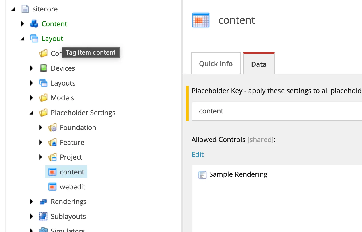
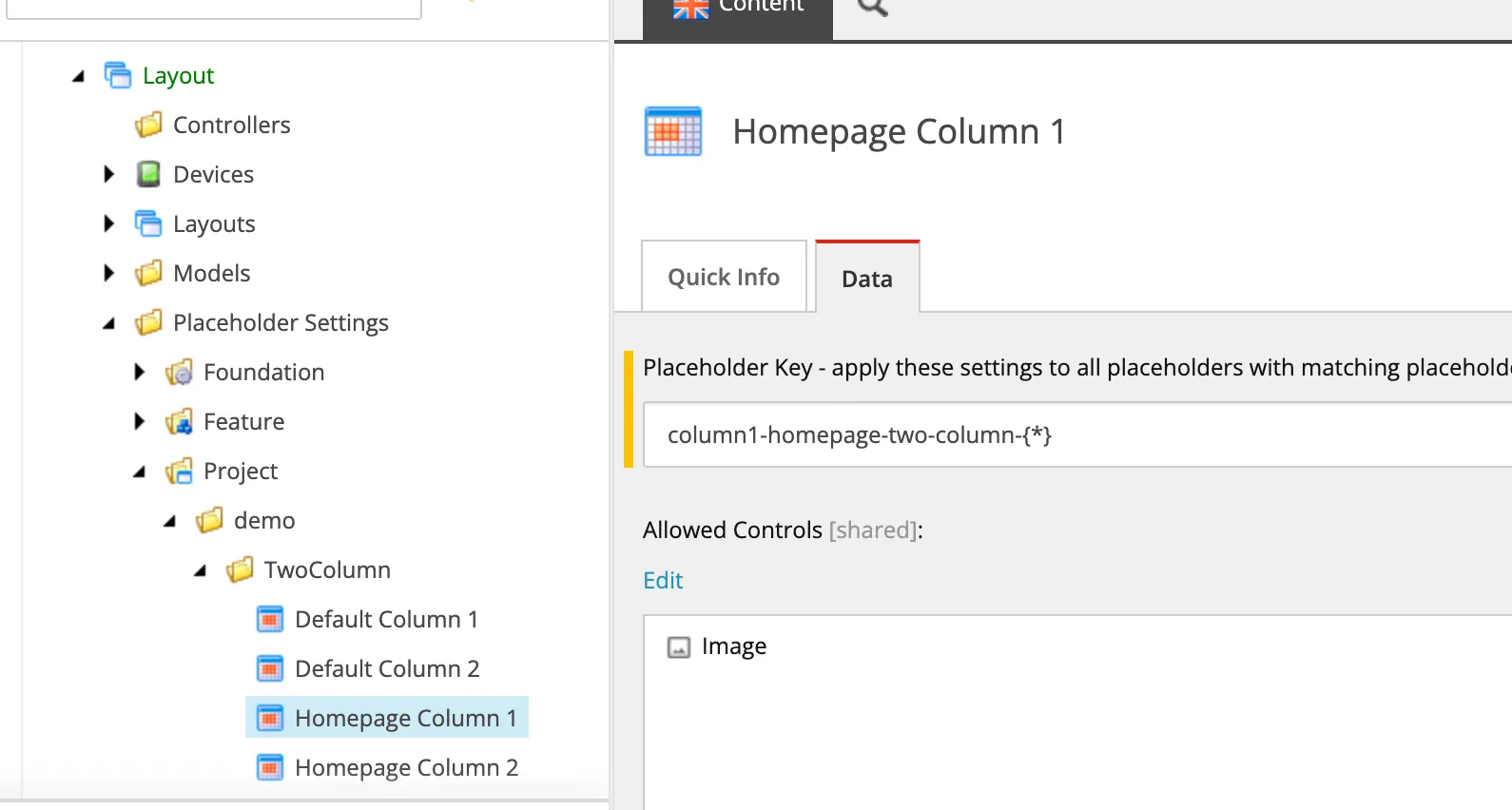
Step 2: Setup your Placeholder Settings
Next, we will add in the Placeholder Settings for our component created above. The settings are what control what will be allowed in the component. We will create two placeholder settings (one for each column) for each variant. In total, there will be 4 placeholder settings. Here is the goal for each setting
- column1-homepage-two-column → Allow Image only
- column2-homepage-two-column → Allow Image only
- column1-default-two-column → Allow Any
- column2-default-two-column → Allow Any
You should have something like this
Once those are created, set them to the rendering under the Layout Service Placeholders field
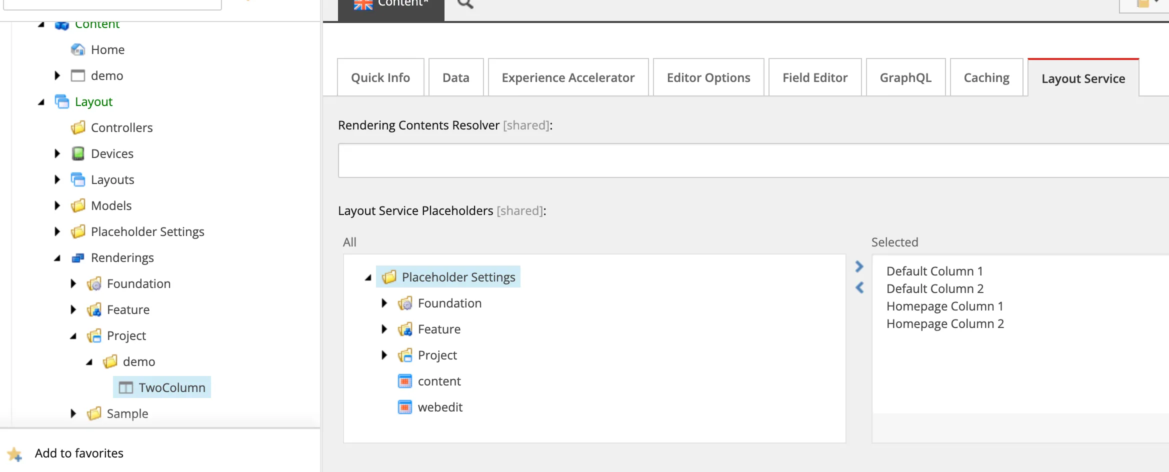
Step 3: Add the Rendering Variants
The Rendering Variants will instruct Sitecore to call a function within your component other than the Default one. This can be further customized to only allow some variants on a specific page type.
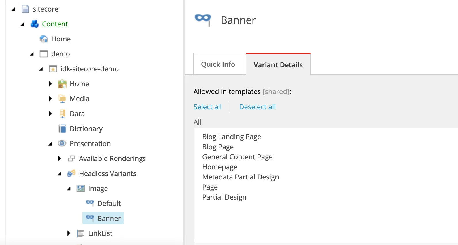
- Navigate to your site and open up the Headless Variants under
/sitecore/content/demo/idk-sitecore-demo/Presentation/Headless Variants - Insert your Variant. NOTE: The
Item Nameof the Variants folder MUST be the same name as the Component. In this case, we named our component TwoColumn. Therefore, the variants folder will be named TwoColumn - Create the two variants under the TwoColumn folder. We will name them
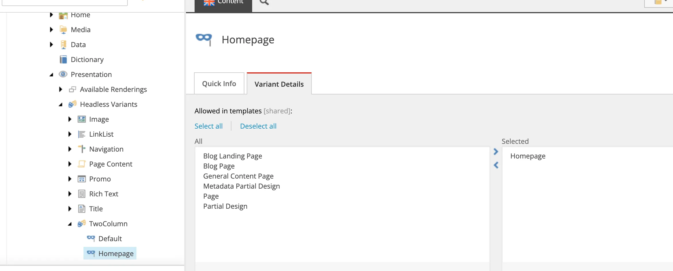
HomepageandDefault(these names will be important later) - Assuming a page type has already been created for the Homepage, we will set the variant to only be allowed on the
Homepage. For theDefaultvariant, we will only allow that on aGeneral Content Page
Step 4: Create your React Component
Now we will tie it all together with our React component. You will see a basic example below of what I wrote to make this possible. I created a function called RenderBody which does the bulk of the work. However, this function must not be exported. Rather, we export the function Homepage and Default (equal to the names of the variants above). The RenderBody function accepts an argument where we can pass in the placeholder of our choosing. We can therefore set the respective placeholder names equal to the placeholder settings we also set above. Therefore, the Homepage variation will only render the placeholder with key column1-homepage-two-column-{*} and column2-homepage-two-column-{*} which only allow images to be inserted into them. Default will call RenderBody with its own placeholder key restricting what can be allowed into it.
Result
Once this is all hooked up, head on over to the Page Designer to see all the magic happen.
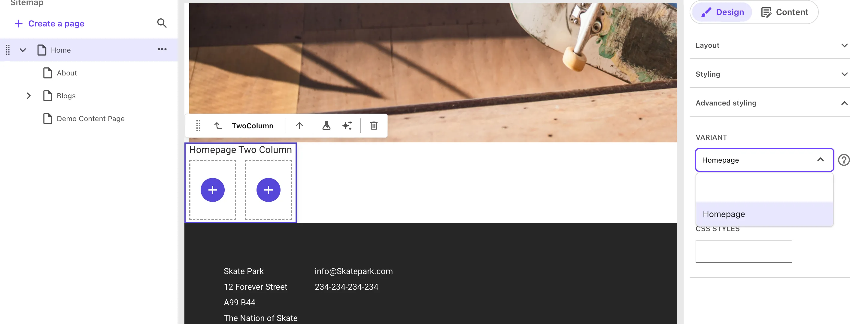
Notice on the homepage when I insert a TwoColumn component, only the Homepage variant is available to the content author. And if you select the placeholders within them to add a component...
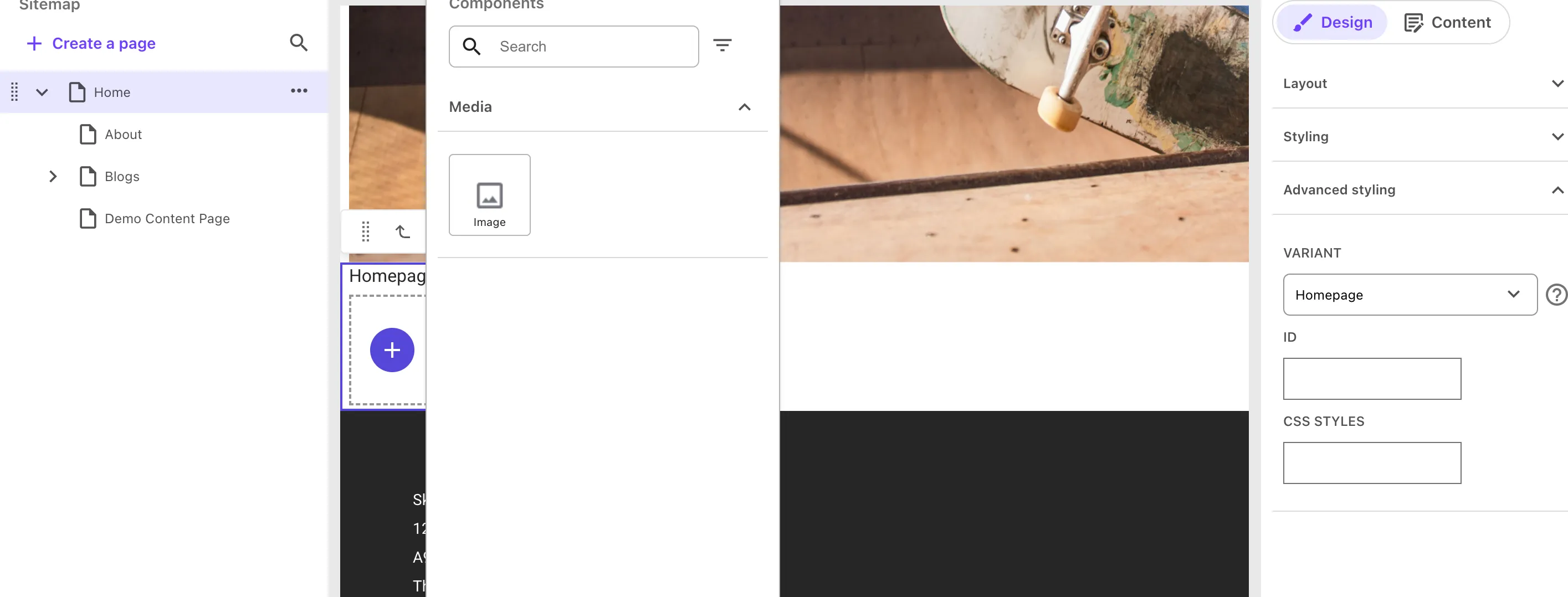
You will see only an image is available. But if you insert the TwoColumn into a General Content Page...
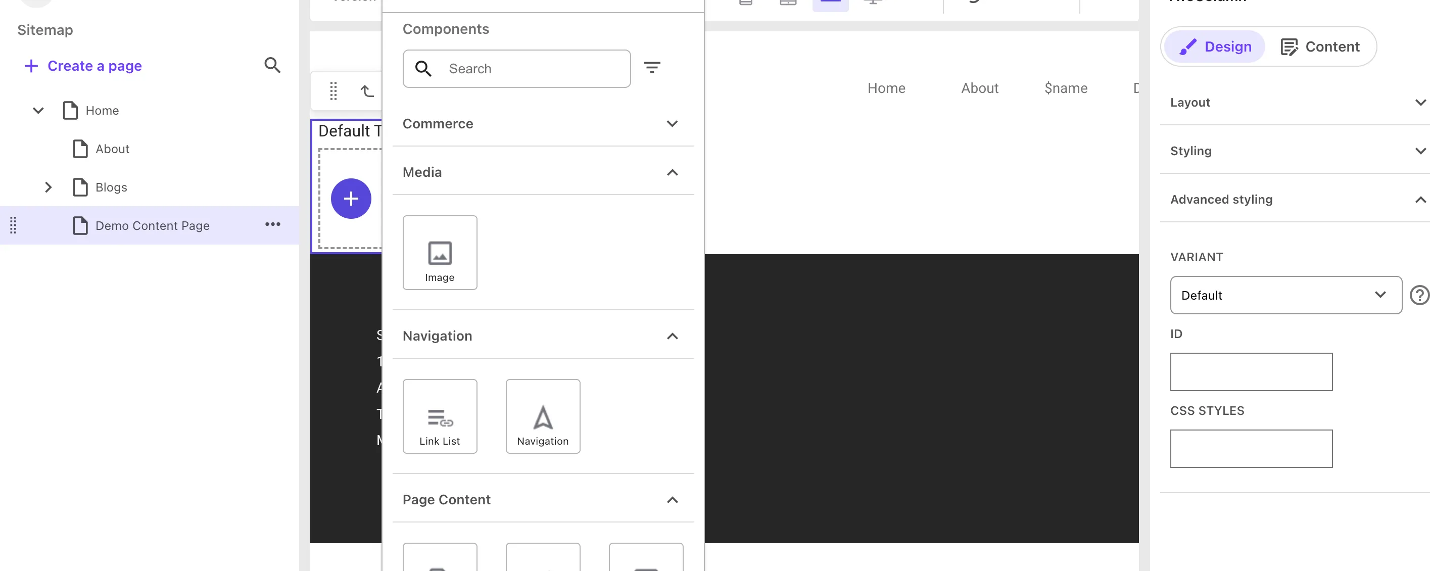
The content author is allowed to insert whatever they want. Giving them the flexibility to design a content page to their choosing but restricting them on the Homepage to stay within the design requirements.
Conclusion
Rendering Variants and Placeholder Settings aren’t just optional extras—they’re core to delivering dynamic, safe, and scalable components in XM Cloud. With just a few clean practices, you can empower your authors while keeping your architecture maintainable.
 Made in React Bricks